10 Tips For Designing Landing Pages That Will Boost Conversion 2021
 October 27, 2021
 Landing Page Website Designing Services
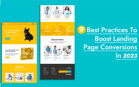
A landing page is designed with the aim of converting visitors into leads. Once the user is on your landing page, it is important to guide and encourage them to take the desired action.
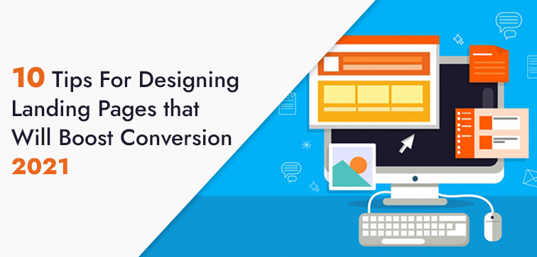
In this blog we have come up with ten effective tips which will help you customize and design successful landing pages that interact, inform and persuade the target user to complete the call to action. Without further ado let’s jump right into it.
Midas is a Custom Web Development Services company with more than eighteen years of industry expertise. We are here to help you notch up your business on an online platform. Check out our services section for more information.
10 Proven & Easy Tips For Designing Landing Pages To Drive Massive Traffic & Conversion:
1. Identify & Establish A Goal For The Landing Page:
Ideation and process come second to goal setting. Establish a single goal for your target landing page and then you can decide what are the elements that you will require to achieve the set expectation/aim.
This step is important as it will help you refine your landing page elements and get rid of any feature that might not serve your user when they are reaching the set goal. Avoid using design elements and features that can lead to indecision on the user’s part.
2. Layout and Landing Page Design:
Create a clear, engaging, and user-focused landing page that is persuasive and user-relevant and thus it is essential to start with the landing page copy or content.
Decide an appealing and attention captivating headline for the page. The next element is a precise and power-packed description of your service/product along with a product image. Lastly, comes the CTA (call to action) to convert your prospective leads.
3. Brief Content & Landing Page:
Your user will spare just a couple of seconds before they make a decision whether they would like to stay on the page or quit it all together.
To improve your chances of engagement with your target audience, make sure the landing page copy has a brief and simple description with proper power verbs to keep the reader interested.
In cases when a lengthy description is a need, then you can use bullet points and subheadings to break text into concise paragraphs.
4. Above The Fold & Main Message:
The area above the fold which is the space of the landing page which is easily visible without the need to scroll. Above the fold, part is crucial and critical as your user is most likely to see, read and check the information you will provide in this part of the page. Make the most of it by including very important information along with a suitable CTA button.
5. Landing Page Design, Images & Media:
Every element of your landing page plays a crucial part in lead conversion. Media elements such as images & videos will contribute to the visual appeal of the page which will attract the attention of the user. Simplify your marketing and sales message with these elements on your landing page.
6. Landing Page & Options To Exit:
Since you have set a particular goal for your landing page and you want the user to complete that goal, it is essential to get rid of distractions.
The more exit opportunities you will provide on your page, the more is the possibility that the user will get distracted. You can consider hiding the main navigation bar and removing social sharing buttons from your landing page.
Avoid adding any external link to your landing page that can take your visitor to a different site.
7. One Landing Page To Cater Specific Campaign:
You create/curate more user-relevant and campaign related landing page content when you are dedicating one landing page for one specific campaign.
It helps in designing more interesting and persuasive landing pages for your target audience which improves the chances of conversion on your page.
8. Landing Page & Value Proposition:
Your user must get the clear information on the valuable return they will get by engaging with your business.
For instance, if you are aiming for getting users to subscribe to your mailing list then first offering them a special discount or a free ebook is something that will motivate them to go with the process.
Offer something valuable in return for the favor you are asking from your target audience and that way they will hesitate a little less in engaging with your company/brand.
9. Compelling Call To Action:
Your call to action button is the final step to complete the landing page goal. Place your call to action buttons on the page where it is easy to locate and has a persuasive tone to it.
Contrasting colors for the call to action button along with compelling phrases will motivate the user to complete the action.
10. Test, Refine, Implement:
There is no shortcut to finding which landing page format will be successful for your campaign.
That’s why A/B testing is used to monitor the performance of different landing page designs for the same campaign.
Once you have achieved the best result with one of the design formats, you can refine it to implement on similar campaigns.
Conclusion:
These were our ten simples (but not easy) ways to make sure your landing page has boosted in lead conversion. Simplify the design, keep the message clear and readable. Run A/B testing to decide on the best option that you have for the campaign, and once finalized, refine the design further. Midas offers you custom web development and design services from India; we also specialize in the mobile application development, landing page designs, and website optimization. Feel Free To Reach Out To Us. Call Today or Leave A Message.
popular post
-
10 Types of Healthcare Software To Notch Up Your Medical Business

-
10 Practical Website Design Tips To Boost Your Site Conversion 2022
-
10 Reasons To Decide If You Need To Update Your Website This Year
Categories
- Internet Marketing (13)
- Software Development (8)
- Mobile Apps Development (44)
- Web Designing (32)
- Web Development (60)
 business@midaswebtech.com