7 Ways To Upgrade Your Contact Form To Boost Conversion Rate
 June 10, 2021
 Web Development Services Website Development Services
A website has a complex structure and design which we often don’t realize until we see how a customized website performs way better than an off-the-shelf website. A website that we put out there for the online community has some goals and thus it is customized and designed in such a fashion to achieve those desired results.
Desired results could be in the form of leads, conversion, or customer engagement, which are important for your website’s success as they will ensure that your business is able to connect with the prospective clients/customers.
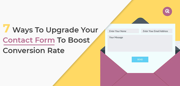
Through our blog section, we often come up with topics and blog ideas that will help you grow your online business by revamping and refurbishing your websites and applications. Today we will be revealing the 7 easy ways to check if your contact form is in the right arrangement so that it can contribute to maximum conversion rate.
We build and design custom websites and offer bespoke Web Development Services from our Delhi based company. Midas is your trusted website service partner for end-to-end website solutions. Call today!
7 Tactics to Improve Your Contact Form for Better Conversion:
When your user willingly shares their contact information with you, you actually get the opportunity to connect better with them and ultimately gain conversion. Contact forms available on your website have a big role to play in the conversion process and if done right you will improve your site conversion rate.
Let’s find out how you can optimize your contact forms to make them better for the potential customers.
1. State The Benefits Clearly:
Before we discuss the points on optimizing your form, it is highly essential first to furnish the need for a contact form and determine how to persuade or convince your user to fill it out.
What are the factors that will convince them to fill the form? What are some of the benefits of filling out the form? Make sure to state these points or benefits clearly so the user understands the relevance.
Whether filling out the contact form will offer them access to the gated content or they will get email updates on the latest discounts etc., ensure to highlight these benefits on top of the form.
2. Regulate The Number of Fields You Use On Your Form:
Once the benefits are clearly stated, your user is motivated to fill out the form. Now, to encourage them further to complete the process is by making your form efficient.
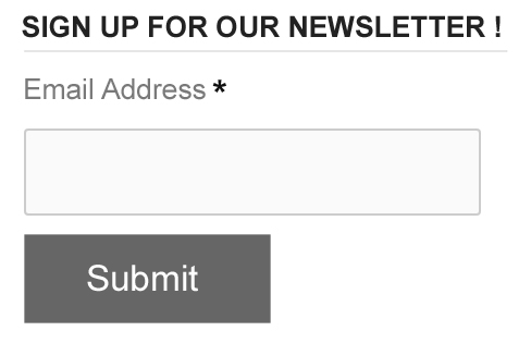
A long form with too many fields is most likely to frustrate them which can lead to giving up before finishing the process.
Try using minimum fields and only those which are absolutely necessary. If the goal is to get an email subscription, do not waste your time by adding another field for a phone number.
3. A User-Friendly Format Is Crucial:
When we talk about digital platforms such as websites or applications we also specify how being user-friendly plays a key element in gaining more visitors and better engagement.
Similar to websites your form should also be designed user-friendly. The form you design should have appropriate field labels, proper box size for fields; placement of the form on the page is also an important to factor to consider.
Usually, it is best to place your form above the fold. Use a suitable color scheme to make sure the form is visually appealing.
4. A Compelling CTA:
What makes your contact form sharp and well-put together is a CTA button. Tell your user what to do next by placing a strong call to action (CTA) button next to your contact form.
Clear, concise, and easy to notice are some of the key traits of your CTA. Along with CTA, you need to use the eye catching “click here” button to persuade the user to complete the process.
5. A Responsive Design:
We have already entered the mobile age so you cannot leave your mobile users when planning for your web presence or building your website for the online consumer.
A responsive website and mobile-friendly design are necessary and there is no alternative for that unless you are not focusing on a mobile consumer base. More than 50 percent of the web traffic comes from mobile users.
A responsive design will serve your diverse customers without any hassle. Fields will be properly aligned, texts will be readable, and CTA visible when practicing responsive design for your forms.
6. Longer Forms With Proper Break Ups:
We have already discussed why long forms deter users from completing the process. However, sometimes you might need to include long forms and need all those information and you will have to include all the relevant fields to it.
The tactic here is to consider sectioning. Instead of using one long form with 20 to 25 fields altogether, it is better to use short forms with fewer fields and sectioning them across short pages.
Also, include a progress checker/tracker on top of the page that will keep the user updated.
7. Run A/B Testing:
Analytics is today a crucial part of your online success. You need to assess what is working and what is not. Talking about contact forms, it is best to try different versions of your contact forms to see which works best for your business.
Maybe you ended up finalizing two versions of the same form and now want to know which one performs better. In such a scenario, it is best to run A/B testing to finalize your form. Keep the form that generates more conversion and attracts more traffic.
Conclusion:
These were our top seven tactics to optimize your website form and make it better suited for your business goals. Midas is web development services providing company from India and we optimize your website, design them, refurbish them as well as maintain them to boost your site traffic and business revenue through more conversions.
Feel free to reach out to us for more information and the latest services. Do not forget to check out our service section in case you are looking for web development solutions. Give Us A Call To Speak To Our Experts!
popular post
-
7 Signs Your Website Needs A Redesign
-
10 Essential Colors that make Best Logo Colors

-
10 Things To Check Before Your Website Redesign 2021….Part I
Categories
- Internet Marketing (13)
- Software Development (8)
- Mobile Apps Development (44)
- Web Designing (32)
- Web Development (60)
 business@midaswebtech.com