8 Tried & Tested Tips For Mobile UX Design
 August 23, 2022
 Mobile Web Development Services
“When UX doesn’t consider ALL users, shouldn’t it be known as “SOME User Experience” or…SUX?” – Billy Gregory
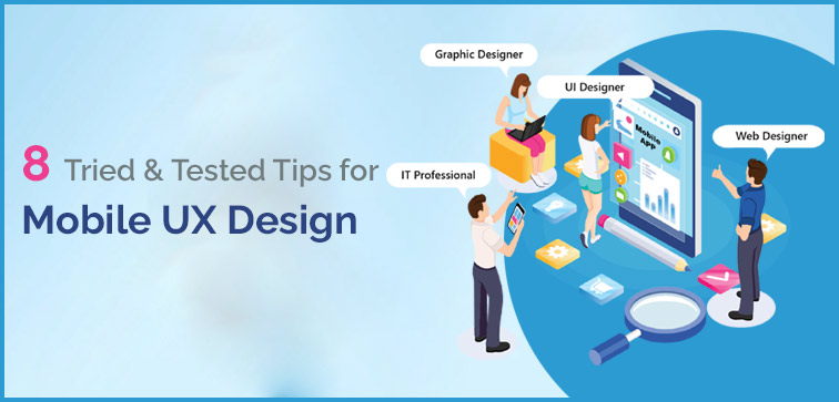
If you are struggling to get the attention of your target audience due to a lack of design and development elements of your mobile UX then this blog is for you. In this, we have listed cherry picked and well-tested mobile UX design tips that will come in handy for your business.
In this blog, we are covering some of the essential UX design tips that are obvious yet missed in many cases. Let’s begin!
Below Are The 8 Top Practices For Mobile UX Design:
1. Single Action Per Screen & Mobile UX Design:
Mobile screens are small (if you compare them to desktop or laptop screens!) and that means from the design point of view, you need to make sure the screen is not crammed with too many actions, information & functions.
Doing so will not only confuse the user, but it will also distract them from following the call to action (CTA). How to solve this problem? You split the actions into more than one single step.
Following single action per screen design tactic will direct the user on their available options. They can quickly choose either to move forward or go back without losing the track of action they are taking.
For the latest Mobile Web and App Development Services in India, reach out to Midas. We have creative and market relevant solutions for your problems which are backed with development tools and resources.
2. Simplified Navigation & Mobile UX Design:
Navigation is the key to keeping your user interested in your site/page so that they can explore and find all the interesting elements that you have put together to design and build an impeccable website.
Without this key factor, you will leave your user clueless and really not interested in checking out your site. They will bounce out as soon as they land on your page.
How to correct this problem? Try to keep your navigation as simple and intuitive as possible. You can make use of simple and recognizable elements that adds to the convenience of exploring the site.
Since we are talking about mobile UX design, make sure the navigation menu is easy to locate and doesn’t hoard a lot of screen space.
3. Match Market Standards & Mobile UX Design:
Be well aware of the different OS platforms and their subsequent designing principles.
As iOS and Android share the major market when it comes to smartphones, you must adhere to their mobile UX requirements and recommendations/guidelines.
This way you will not hamper a smooth user experience and prevent your site from risk of decreased traction rate.
4. Seamless User Experience & Mobile UX Design:
As we have mentioned many times before in our blogs that modern user is impatient because they have numerous options to switch to and there is also an information overload factor.
A UX design that is everything but seamless will lose the race and competition as the end user doesn’t have the time and patience to deal with a lagging design. Focus on keeping design seamless and user-friendly for a better response from the end user.
5. Typography & Mobile UX Design:
Unlike computer screen which is wide and quite spacious, mobile screen size is a challenge and you cannot just put everything out there.
The content needs to be fixed, managed, and arranged in a manner that it serves the mobile user and satisfies their user experience when they are on your page/site. Expert designers recommend using text/typography, size, and inter-line spacing which is easy on the eyes and readable. Roboto for Android and Helvetica Neue for iOS is most preferred typography.
6. Color And Background & Mobile UX Design:
When we are talking about the design and UX, color and background both play functional elements which you want to leverage the most.
Use that white space to interact better with your user by directing the attention to what is important on the current page. The same goes with the element of background color.
You can use it to change as per user’s actions and responses which will look like your application is actively engaging with the user and providing them a better user experience.
7. Overload, Clutter & Mobile UX Design:
You don’t have the luxury to clutter the screen with various functions and information as we are dealing with mobile screens and relevant designs. It is absolutely necessary to keep your screen as tidy as possible.
As mentioned above, use the principle of simplicity and single action per screen tactic.
8. User-Relevant Design & Mobile UX:
A personalized UX will enhance your user’s satisfaction and they are more likely to stay on your site/page/application. Based on your user’s current actions or their browsing history etc. you can provide them with a relevant call to action or information/features.
A personalized design is a holistic way of looking at the design development and that means it is not limited to just content recommendation, it also means the font size options, dark/light mode options, etc. every element that can contribute to a better user experience.
Conclusion:
These were the eight UX design tips pertaining to mobile applications. With mobile UX your aim as a business or designer/developer should be to improve your application’s efficiency by adopting the tried and tested design elements and tips.
Hope you enjoyed this blog on UX. Feel Free To Reach Out To Us For More Information. If you are starting a new project and looking for professional mobile web and app development services from Delhi, you can contact Midas. We’re just a call away!
popular post
-
Top 10 Tips to Improve Your Social Media Presence in 2017

-
What Are The 7 Key Characteristics Of High-Converting Landing Pages?
-
Learn About the Mobile App Marketing
Categories
- Internet Marketing (13)
- Software Development (8)
- Mobile Apps Development (44)
- Web Designing (32)
- Web Development (60)
 business@midaswebtech.com