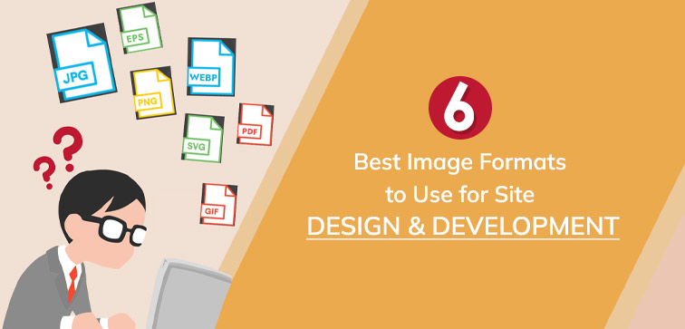
6 Best Image Formats to Use for Site Design & Development
 November 7, 2023
 Web Development Services Website Designing Services
“Good design is making something intelligible and memorable. Great design is making something memorable and meaningful.”
Through our blog posts, we make sure that our readers get the latest and relevant updates that are present out there pertaining to the website, design, and development. Midas has a long history of serving the web tech industry with novel solutions for website design and development and we want to continue doing that.
In this blog, we will share some of the most suitable image formats that you can use to improve your site design and development in terms of optimized performance that improves the website’s growth and operations. Before we proceed with our list of points, here is a quick reminder, if you need the latest and bespoke Web Development Services from India, you can reach out to us through a call or direct message!
Top 6 Image Formats For Site Design and Development:
1. JPEG (JPG):
Among the most prevalent image formats on the web, Joint Photographic Experts Group (JPEG or JPG) has maintained its popularity since its inception in 1986.
What makes it stand out is its efficient use of storage space, seamless upload and download capabilities, and broad compatibility. Moreover, its small file size doesn’t compromise image quality.
JPEG relies on a method known as “lossy compression,” implying that there is a degree of quality loss each time an image is saved.
This loss affects fine details, even text, resulting in what’s called “artifacts” – small, blocky distortions. However, this quality degradation is often invisible to viewers, especially for photographs.
It’s worth noting that with each subsequent save, the number of artifacts may increase. To preserve the original image quality, it’s advisable to keep a copy in a lossless compression format.
The DPI (dots per inch) information in JPEG is commonly used for printing. While JPEG excels at supporting numerous colors, making it an excellent choice for real-life images like photographs, it has limitations.
It doesn’t support transparent backgrounds or layering with other elements. Nevertheless, for saving photographic images, it remains one of the best choices.
JPEG’s versatility extends to social media platforms where it can leave a lasting impact, as it is ideal for website use.
Many digital cameras and smartphones default to saving images as JPEGs. Keep in mind that due to its lossy nature, each compression cycle permanently removes unnecessary data from the files.
2. GIF (Graphics Interchange Format):
Another widely used image format for web design is the Graphics Interchange Format (GIF), which made its debut in 1987.
GIFs come to the rescue when you need to handle image transfers over slow or low-bandwidth connections.
Unlike JPEG (JPG), GIFs are lossless, meaning they retain all the data contained in the file while maintaining a smaller file size, ensuring no compromise in quality.
They can display over 256 indexed colors. GIFs were originally designed to accommodate smaller and simpler graphic icons. While you can’t attach audio to a GIF, they are a powerful tool for injecting motion into your online content.
Many users prefer GIFs for their ability to add movement and engagement to websites. They are particularly well-suited for limited-color images that need to be kept compact.
Full-color images and photos saved in GIF format benefit from high-level compression. One of the standout features of GIFs is their animation capability, which, despite evolving over the years, remains an effective way to draw user attention to crucial elements on your website, such as a prominent call-to-action.
3. PNG (Portable Network Graphics):
Introduced in 1995 with the aim of substituting GIF, Portable Network Graphics (PNG) stands out when image size is a concern, especially for accommodating large images in web design.
PNG-8, a variant of PNG, is an excellent choice, supporting 256 indexed colors and transparency. Similarly, like JPEGs, PNG-24 can represent more than 15 million colors and, akin to JPG, it caters to static images while allowing for animation, similar to GIF.
A key advantage of PNG is its lossless quality, ensuring that no data is lost due to compression. This feature makes it a preferred format for working with files that require modifications.
PNG excels in providing transparency support compared to some of its counterparts. Offering lossless compression and versatility, PNG allows you to save images without compromising on quality.
While it may yield larger file sizes in some cases, it’s a preferred choice for various graphic images. It’s worth noting that PNG might not be the go-to choice for print applications, particularly when a four-color process is required.
However, it excels in handling screenshots, as many computers automatically save them in PNG format. PNG compression is particularly effective for optimizing graphics images using various color ranges.
4. SVG (Scalable Vector Graphics):
Scalable Vector Graphics (SVG) is a vector image file format introduced in 2011, making it one of the latest additions to the best image format options.
What sets SVG apart is its strength in delivering clear and crisp images at any size or resolution, outperforming other formats like JPG, GIF, and PNG. This is largely due to SVG’s lossless quality, similar to GIF and PNG.
SVG is derived from mathematically driven shapes and curves, rather than pixels, which contributes to its scalability and clarity. It supports animation, transparency, and a combination of colors or gradients.
Keep in mind that SVG files tend to be larger in comparison to other web image formats like GIF and PNG.
5. WEBP:
Google introduced the WEBP image format to provide a versatile, web-friendly image format that addresses specific use cases. It employs advanced functionalities such as block prediction and is a derivative of the VP8 video codec.
Unlike JPEG, WEBP supports both lossless compression and the incorporation of animations and transparency, combining the benefits of lossless and lossy compression.
WEBP serves as a viable alternative to traditional formats like JPG, PNG, and GIF. However, one drawback is that it lacks universal support. Initially limited to Google-powered software like the Chrome browser and Android-native apps, it has only recently seen expanded adoption.
Notably, Microsoft Edge and Firefox announced support for WEBP starting in 2019. Nevertheless, it’s essential to bear in mind that Apple, Safari, and iOS do not yet offer compatibility with WEBP
6. HEIC/HEIF:
The HEIC/HEIF image format presents an evolution in two distinct dimensions. Firstly, the file container supports the most extensive feature set among available image formats.
It can handle multi-frame images with multi-frame compression, a crucial feature for High Dynamic Range (HDR), multi-focus images, or images with multiple views. Secondly, HEIC/HEIF is versatile in supporting various types of non-image data.
Most images in this format are compressed with a derivative designed for the H.265/HEVC video codec, catering to the 4K and 8K resolutions prevalent in modern displays. HEVC encoding involves highly intricate operations but fewer restrictions compared to JPEG.
It delivers higher compression efficiency at the expense of longer coding times, which typically does not pose a problem in web-related workflows.
Conclusion:
At Midas, we’ve successfully led over 2000 projects, including website design, development, app development, and more, all delivered on time with client satisfaction. Our global clientele values our web development and design services. Contact Us for efficient and affordable site assessments and design solutions. Explore our services section for details!
popular post
-
Do You Know About These 5 Facts On Website Development Services?

-
5-Step Guide For A Successful Local SEO Strategy

-
6 Tips To Design An Unforgettable App Icon In 2023
Categories
- Internet Marketing (13)
- Software Development (8)
- Mobile Apps Development (44)
- Web Designing (32)
- Web Development (60)
 business@midaswebtech.com