9 Best Practices To Boost Landing Page Conversions In 2023
 July 7, 2023
 Landing Page Web Development Services
“The best landing pages are simple, clear, and persuasive.” – Neil Patel
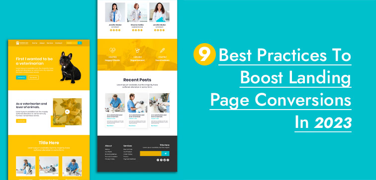
Growing your business online requires trying out various marketing tools that target your niche market and using them to prosper and establish your brand online. Landing pages are considered gateways to generate leads and sales.
Professionally crafted landing pages have the potential to increase conversions and sales for businesses by up to 50%. In this blog, we are going to share some of the best practices that you can implement to customize high-conversion landing pages for your business.
Before we move on to the practices, let’s take a moment to introduce ourselves. We’re Midas, a team of expert designers and developers who create leading websites, web applications, mobile apps, and landing pages for businesses of all sizes.
If you’re looking for a team that can help you take your business to the next level, then look no further than Midas. Feel free to reach out to us today for the latest Web Development Services!
9 Best Practices For Creating Top Landing Pages:
1. Placement Of Value Proposition Above The Fold (ATF):
Not to be dramatic but the moment a visitor reaches your landing page, it is a race against the time! Every second counts and make sure your page is interesting enough to keep them hooked to your page till the end.
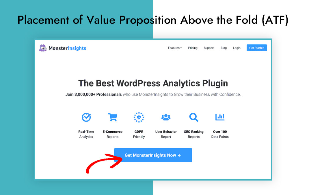
Make sure to use your CTA (call-to-action) or value proposition above the fold (the part of the landing page which is visible without scrolling). Use this above the fold area are to highlight your important offer.
2. Single Conversion Action To Prevent Choice Paralysis:
It is best to curate your landing page for one conversion goal. Doing so will prevent your visitor from distracting and losing interest.
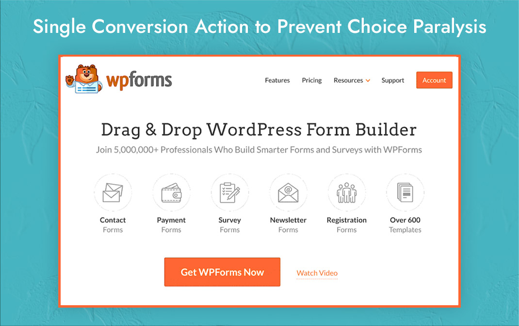
Thus, before customizing your landing page, decide on one clear goal and one clear action that you want your visitor to take. Use clear language along with strong, impactful visuals to highlight your offer and use easy to click CTA button.
3. Don’t Make Your Visitors Wait:
Potential customer visiting your landing page has an interest in the offer you promised and you have a goal (as a business) to attain.
It is best to deliver them the promised offer as soon as they have completed the action they are requested to complete.
For instance, if you are offering a free eBook in exchange for an email address or contact information, make sure your visitor gets that eBook as soon as they submit their email address or contact information.
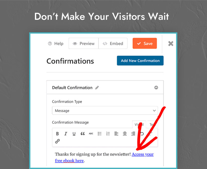
Don’t add more hurdles like confirmation email or OTP etc. It will discourage the visitor and they will abandon your page.
Direct exchange and delivery of offers without delay will leave a good impression on your visitor and they are more likely to sign up for your newsletter or any other action that you would want them to take.
4. Make Your CTA Scream, “Click Me!”:
Your CTA has to be the show-stopper! Make it color-highlighted and well-placed so that a visitor is not able to not see it.
This CTA button is important as it clearly tells the visitor what action they must take (it could be downloading your eBook, making a purchase, or signing up for your newsletter).
Apart from using contrasting colors for your CTA, keep the CTA text clear and concise, and make sure you don’t have to spend minutes looking for it, rather it should be easily visible.
5. Features Are Nice, But Benefits Sell:
Another landing page conversion practice would be to focus on the benefits of your product or service.
Your landing page copy should highlight the benefits of your product or service so that the visitor can assess how your product can make their life better.
The prospective customer is looking for a solution to their problems and that can be done by showing the benefits and not features.
6. Multiple Ctas For Longer Landing Pages:
If you are using longer landing pages, don’t make your visitor to scroll to find the CTA, instead place multiple CTAs throughout the page.
This will ensure that visitors can take action whenever they want without needing to scroll up and down and look for the CTA.
You can place CTAs at the top, middle, and bottom of the page as well as in the side columns. CTAs should be consistent in terms of color, font size, and text.
7. Optimize For Mobile:
Over half of all web traffic comes from mobile devices and thus it is important to optimize your landing pages for the mobile devices as well.
You will lose a huge number of potential customers without optimized landing pages. A responsive design will work for different screen sizes and it will contribute to increasing your conversions.
8. Don’t Be Afraid To Test & Experiment:
Don’t just stick to just simple changes and experiment with big changes that can actually revamp your landing page and streamline the user experience.
You can try out different layouts and experiment with color palettes and headlines etc. Use testing tools like Google Optimize to check your landing page efficiency.
9. Tailor And Optimize Your Landing Page For Your Audience:
Optimize and customize your landing page depending on the expectation of the target audience coming from a particular source.
For instance, it is very likely that audience/visitors coming from social media are not aware of your brand and not in the later stage of the buying journey.
For this particular audience, your landing page can be optimized as a lead magnet (for instance, offering a free eBook in exchange for an email address, etc.).
In the case of PPC traffic, you can customize your landing page with the free trial and discount offers on your service or products, which will persuade them to take the desired action.
Conclusion:
These were some of the landing page customization practices that can help you bring in more relevant leads and increase conversions for your business.
Here’s another bonus tip: headlines of your landing page can drive sales if done correctly. Use powerful words that can compel users to pay attention to your value proposition and perform your desired actions.
Also, consider mentioning social proof on your landing page, as it adds credibility to your brand name and the visitor is more likely to purchase from you. Midas has a proven track record of success, with over 18 years of industry experience and a portfolio of noteworthy projects. For web development and designing services from India, you can Call Us For Professional Assistance. Stay tuned for our next blog update!
popular post
-
New Age Business & Introduction to Chatbots
-
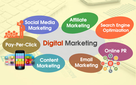
SEO in Digital Marketing is Indispensable
-
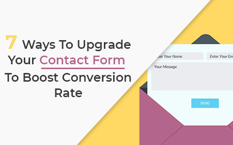
7 Ways To Upgrade Your Contact Form To Boost Conversion Rate
Categories
- Internet Marketing (13)
- Software Development (8)
- Mobile Apps Development (44)
- Web Designing (32)
- Web Development (60)
 business@midaswebtech.com