Did You Know These 10 Ways To Enhance Your Site Accessibility?
 August 17, 2021
 Custom Web Development Services
“Store windows are like landing pages on the website.”- Angela Ahrendts
It might not occur to you but if your website is not easily accessible it will directly affect your conversion rate and the user engagement. If your aim is to expand your business, then it is imperative to have a website that is easy to access by your diverse audience.
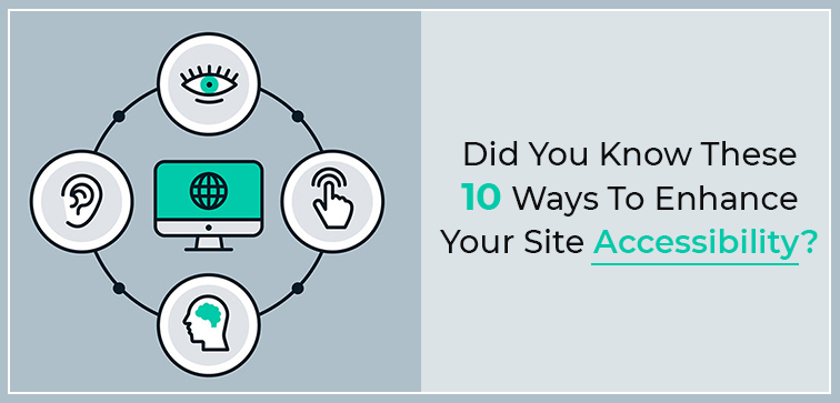
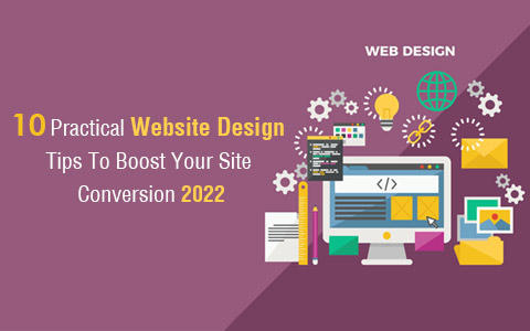
Is your site able to engage with users with physical challenges such as impaired vision? As it is important to understand, a regular design and features will not be enough to meet their special needs.
Through this blog post, we are sharing ten easy and effective ways to make your site accessible to a wider demography of audience/user/online consumer.
Midas and it is Custom Web Development Solutions from India are what you need if your site is on the web but doesn’t do any magic when it comes to engaging with users, getting the right traffic, and building the brand reputation. We do it all and with complete finesse. Call today to know more!
Here Are 10 Ways To Take Your Website Accessibility To A New Level:
1. Website Accessibility & Keyboard:
Is your site easy to navigate without using the mouse? To put it in simple terms, is it possible to go about your website using just a keyboard?
For instance, if a user is trying to fill out a form, are they able to tab between fields using the keyboard?
Make sure that important elements on your site are easy to access using keyboards apart from the mouse which will make your website accessible to different users meeting their needs.
2. Website & Color Selection:
Your audience with vision impairment (also color blindness) may struggle to get the best of user experience on your site if the color choices are not suitable.
You can use italics and bold when trying to differentiate or highlight your text. You can utilize color contrast to set your site elements apart.
3. Website Accessibility & Alt Text:
Alt text is another very useful feature and detail that you can use to provide a better understanding of the image (you are using on your website) to your audience with visual impairment.
However, it is not recommended to stuff your alt text with a lot of keywords and it is important to follow SEO practice when using alt text.
Your alt text should describe what the image is about and should be easy to understand.
4. Website & Resizable Text:
Text resizing allows a user to increase the text size while maintaining the functionality of the content. Visually impaired users can easily access the content without assistive technology with resizable text functionality.
Three common ways to adopt the resizable text feature are either by using relatable text sizes or implement a mechanism/feature on screen that permits the user to adjust the text size or using the browser’s zoom feature that also allows the font resizing option.
5. Website Accessibility & Video Content:
It is common to use video content on a website. However, for users with hearing impairment, it can be a challenge to understand the video content.
You can add captions for your video content to make your website more engaging and user-relevant.
6. Accessibility & Embedded Media:
If your website contains embedded audio and video files with auto play features then it can impede a seamless user experience on your website.
Especially, it can be a challenge for visually impaired users who are using screen-reader to navigate the website. To make your website user-friendly it is best to not include automatic navigation of media files.
7. Website & Structuring Date:
Make your site content easy to distinguish, read and understand by using headers. Suitable use of headings and sub-headings will not only improve your content structure but it also improves navigation for specially challenged users who use screen-readers to navigate through the site. Also, make sure to use the headers in correct order and count.
8. Form Accessibility on Website:
Like other elements of your site, the form section should be properly and clearly labeled. Also include precise instructions on the form filling process. You can leverage the white spaces between fields to provide a clear distinction between every element of the form.
9. ARIA Landmark Attributes & Accessibility:
Using Accessible Rich Internet Applications (ARIA) Landmarks along with HTML5 attributes you can turn your web pages more assistive technology-friendly and enhance accessibility for your users.
10. Website Accessibility & Formatting Table:
If you need to include data in the tabular form then try laying out the data in such a way that it doesn’t end up being tables with a lot of rows and columns.
Complexity will lead to poor user experience as it is not screen-reader-friendly. Label your rows and columns clearly and keep your page well-structured that is easy to access through a screen reader.
Conclusion:
These were some of the important steps that you can take to enhance your site design and usability for diverse users. It doesn’t take any extra effort on your part but it will immensely improve your site accessibility factor. If you are still not sure how to build your website market-relevant then it is time to reach out to Midas as we develop bespoke websites with the latest features and designs. For leading web development services and solutions You Can Reach Out To Us Anytime. Call Today!
popular post
-
10 Factors for a Breakthrough in Website Designing
-
Part II – 5 Key Things to Review when Aiming for a High Performing Website
-
12 Ultimate Things to Include in your Website & 5 Things to Avoid
Categories
- Internet Marketing (13)
- Software Development (8)
- Mobile Apps Development (44)
- Web Designing (32)
- Web Development (60)
 business@midaswebtech.com
