5 Key Guidelines To Master Intuitive UI Design
“The key to exceptional UI design is empathy – understanding the user’s needs and creating an interface that caters to them seamlessly.”

The digital landscape that we are engaging with in today’s time is far more superior in technology as well as challenging compared to what it was just half a decade ago. This means you must be ready to stay in the lead in this competition of “getting desired users’ attention.”
User Interface, Website, and Target Audience:
User Interface plays a pivotal purpose here for businesses who are trying to engage with potential consumers online. A great UI design will have a user-centric focus, competitive edge, accessibility, and inclusivity, adaptive to a variety of devices, along with being efficient and productive for the business.
When all these salient traits are present in your UI, your site or application will undoubtedly get the attention of the target audience and potential buyers. Through this blog, we will learn about the five key principles or you can say guidelines that you should consider when revamping your site UI.
The core principles of UI design prioritize an optimized user experience.
At Midas, we’re not just another web design and app development firm; we’re an ISO German Certified industry leader based in Delhi, committed to transforming your online presence.
Our impressive clientele spans the globe, and we’re ready to take your website to the next level. Explore our extensive range of services, including top-notch Web Development Services. Are you ready to boost your online website presence? Contact us today for a conversation that could reshape your digital future!
5 Essential UI Principles To Master User Interface Design:
1. Focus On Clarity And Simplicity:
An exceptional design will have the salient and most important features, that is, clarity and simplicity.
A well-designed interface should provide users with a clear path to accomplish their objectives without unnecessary distractions.
Simplified user interfaces yield intuitive products that engage users and meet their requirements.
You can witness that popular applications such as Instagram, Twitter (now known as X), and Pinterest boast elegantly simple interfaces that empower users to achieve tasks effortlessly. These platforms trim away extraneous features, focusing solely on core user needs.
i. Utilize White Space Effectively:
Whitespace, the negative or unmarked space within your interface is a part of the design and has a crucial visual purpose. Whitespace in your design allows your UI elements to stand out. You can say that whitespace creates a visual breathing space that aids users in processing information seamlessly.
ii. Consistent Typography:
Mismatched fonts introduce confusion into the user experience. Opt for a single font for body text and another for headlines, maintaining this typographic style consistently throughout your interface.
Fonts like Verdana and Georgia (which are considered legible fonts) facilitate easy processing of information without much hassle.
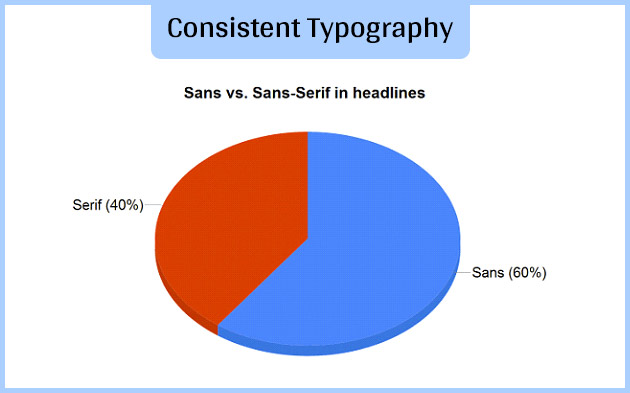
As per available data, about 60% of websites use sans-serif fonts for headlines, with Arial, Verdana, Lucida Grande, and Helvetica also in the most used fonts.
Another factor to consider is to align your brand identity and font selection for the design; the two should complement each other.
2. Maintain Consistency & Familiarity:
A compelling UI design should establish consistency and predictability within interfaces so that the user feels comfortable to use the system without getting overwhelmed. Although consistency alone does not define good design, however, it does lay the essential groundwork for creating effective and intuitive user experiences.
i. Consistency In Design Patterns Across Multiple Platforms:
In order to achieve consistency and familiarity with respect to UI design, it is essential to have consistent design patterns across various platforms (such as mobile, desktop, web, etc.). This will contribute to ensuring familiarity in visual style, and interactions for the user.
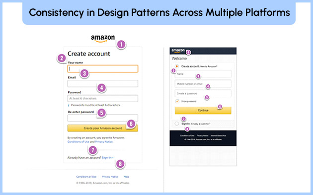
For instance, Amazon (a leading e-commerce platform) maintains uniform navigation and checkout processes across its website, mobile app, and Alexa voice assistant, fostering a cohesive customer journey.
ii. Provide Familiar User Workflows:
Aligning registration forms, checkout procedures, navigation menus, and common tasks with familiar workflows streamline user interactions, enhancing efficiency and user confidence.
Reducing cognitive load through consistency elevates overall user experience and drives higher conversion rates.
The advantages of infusing consistency and familiarity into your UI design encompass smoother onboarding for new users, intuitive navigation, fewer user errors, and elevated perceived usability and trust in your product.
Moreover, consistency bolsters brand identity, forging a lasting connection between users and your brand.
3. UI Responsiveness & Flexibility:
Flexibility and responsiveness stand as significant principles in UI design as they ascertain that users enjoy an optimized experience across different devices.
To implement these principles, it is best to adopt a mobile-first strategy, focus on creating scalable interfaces, and employ responsive techniques.
Utilize responsive techniques like fluid grids, media queries, and adaptive images as it allow a single design to adapt seamlessly to screens of all dimensions.
Scalability in interface design is achieved through responsive design techniques, fluid and percentage-based layouts, scalable interface elements, provision of multiple interaction modes, and the facilitation of content accessibility for all users.
4. User Interface, Feedback and Interaction:
Effective feedback methods form the bedrock of user-friendly interfaces. Providing relevant cues in response to user actions fosters intuition which boosts the user’s confidence while navigating through the site and design system.
This UI design principle focuses on improving user interaction through feedback. This can be attained by providing effective visual and audio cues to indicate the next steps for users clearly.
Also, adding contextual, informative messaging to guide users through the navigation processes. Doing so will contribute significantly to user engagement.
Visual cues, such as colored icons, progress bars, and highlights, serve as clear indicators of the next steps available to users.
In suitable situations, augment visual cues with audio elements like clicks, beeps, and voiceovers to accommodate users with visual impairments.
You can use on-screen messages to provide contextual information to the user which will guide them through the processes. When addressing errors, combine visual cues with plain language explanations and actionable next steps.
5. Navigation, Information Architecture, & UI:
Another UI design principle that is critical to the success of a design is the navigation system and information architecture. Both these factors will determine if the User Interface design is intuitive or not.
It is essential to implement clear navigational structures along with logical content organization.
Opt for the hierarchical navigation system that divides content into categories and sub-categories to maintain a coherent hierarchy.
Employ descriptive labels and intuitive icons to facilitate user navigation between sections. Consistency in navigation placement and style will refine and boost usability.
For implementing optimal information architecture, it is best to use logical methodologies such as sitemaps, wireframing, card-sorting techniques, etc.
Regularly testing navigation and information design with users during the development phase identifies and rectifies usability issues, guaranteeing an intuitive experience upon launch.
Iterative testing and refinement yield a navigation system that seamlessly guides users to their intended destinations.
Conclusion:
These are some of the important UI design principles that will help you in crafting user interfaces that are functional as well as user-friendly. It is essential to not forget that through your interactive designs, you are engaging with humans, the human element of your design should be at the forefront, and based on that you can improve your design using real user feedback.
Midas is one of the leading and expert web development services and designing solutions providing companies from India. Feel Free To Give Us A Call to learn how to enhance your site’s usability factor and overall website performance. Check out our services section for more details and stay tuned for our next update!
popular post
-
Do You Have These Critical Business Website Elements? – Part I

-
Best UI Techniques for Creating Popular Mobile Application

-
How Your Website Design Can Contribute To Search Engine Optimization?

Categories
- Internet Marketing (13)
- Software Development (8)
- Mobile Apps Development (44)
- Web Designing (32)
- Web Development (60)
 business@midaswebtech.com
 October 6, 2023


