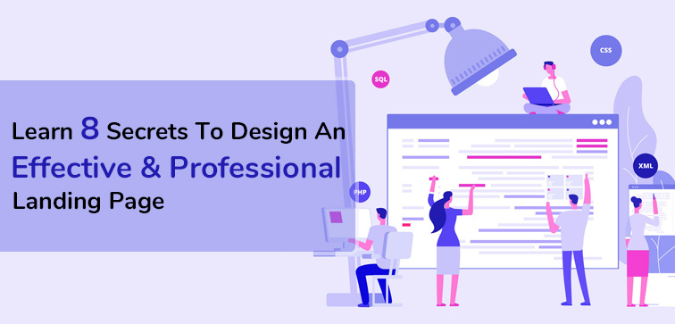
Learn 8 Secrets To Design An Effective & Professional Landing Page
 October 30, 2020
 Custom Web Development Services Landing Page
“You have to stand apart by offering high quality, relevant experiences to audiences that you truly understand.” – Adam Audette
We are already knee deep in this present internet age and every one is somehow dependent on the web for information. It is no surprise that there are more than 543 million websites on the internet that are active as we speak.
As the technology has advanced and evolved so has the competition in the market which has evidently skyrocketed. How do you maintain your business presence valid and in the eye of the target consumer without a proper strategy that serves the contemporary online market? Your website should be one of the top priorities when setting up your online business.
Persuasion works when you are the real deal meaning your business has something solid to offer that your potential customer might be interested in. That’s why it is important to know the right tactics to design your landing page that will highlight the salient features of your business/services/products and your user can easily see that and eventually go through the information provided and lastly reach out to you for the service through a call-to-action button.
Midas is your technology partner and Custom Web Development Company for engaging and quality websites that boost business and engages customers. Give us a call for more information!
Through this blog post, we will be sharing some key points that you must consider when creating your business landing page so that it has the right elements which make it compelling, authentic, persuasive, and engaging.
1. We Highly Recommend Using A Striking Headline:
We are talking about the headline that captures the attention of the user and prevents them from abandoning the site in the middle of navigating through the page.
The headline should be precise, clear and definitely, that describes the business/services in an eloquent way. If needed, you can also add a subheading or use a short paragraph for providing relevant information.
If you are using the landing page for running marketing campaigns then make sure the language and essence of the headline copy match with the subheading. Doing so will give a more cohesive look to your landing page and that will boost the possibility of conversion.
2. Use Suitable Image Or Video For Your Landing Page:
Did you know adding relevant images or explainer video (of your services or product) to the landing page can bolster the conversion rate by 80 percent?
Using appropriate and business relevant video and images on the landing page can easily bridge the gap between business and the user and they are more likely to show interest in your product and services.
Video content will communicate and divulge the important information more swiftly which will favor and improve the landing page conversion rate.
3. List The Salient Features And Benefits Of Your Product:
People seldom want to spend their precious time skimming through some cumbersome and lengthy descriptions with little to none quality information.
Transform your landing page into something interesting by turning it into a more readable piece by listing down the key features that you would want the consumer to know about your services.
4. Your CTA (Call-To-Action) Button Should Attract The Attention:
Your call-to-action button should be specific as it will define the path the consumer will take once they reach the end of the landing page.
So, it must clearly specify whether you want your user/visitor to sign up for the newsletter, call your business for more details or purchase the item. Use suitable color and text design combinations for your call-to-action button that is different from the landing page so that it is prominent and easily visible to the visitor.
5. Take Cognizance Of The Page Fold:
Always place the most crucial and important elements of your landing page above the page fold as almost 80 percent of visitors will most certainly notice if the information is present in this significant part of the page.
So, better use this space for important elements such as call-to-action and relevant information as salient features/benefits.
6. Do Not Overdo On Links:
The landing page should be clear and to-the-point with the purpose to help the user with the buyer’s journey so they can complete the specified actions without getting confused and overwhelm by a lot of information (that is irrelevant information!).
Adding a lot of links to the landing page that doesn’t support the target action will only distract the visitor and that is not a good strategy to gain conversion. Reduce the number of links you use on your landing page to keep your visitor focused.
7. Support Your Landing Page With Additional And Quality Details About Your Product:
Since we had to keep the headline and salient feature section quite concise, it is possible that you wanted to add more information relevant to your service/product but couldn’t.
You can use below the fold area of the landing page to describe and highlight the details of your services. You can also use videos and images to motivate and enlighten your potential buyers about your services.
8. You Can Include Testimonials:
Living in the virtual age of the internet you need to put extra effort to persuade your potential clients how authentic and reliable your services are.
When engaging with your clients through the internet, testimonials are a sure way to gain that trust and establish brand credibility. Testimonials from your former clients will support and fortify your claims about your services.
Conclusion:
Find out more about websites and landing pages and how you can create one for your business by reaching out to Midas. You can give us a call or drop us an email for further information. We believe in creating websites that can survive and thrive in the times of high competition and that’s why if you want some specialized custom website development services from our India based firm then Give Us A Call Today! Also, stay tuned to our blog section for more existing and latest technology updates.
popular post
-
7 Proven Ways To Enhance Your Mobile Commerce In 2021…Part II
-
10 Benefits Of Using Progressive Web Apps For Your Business…Part II
-
Top 8 Common Website Navigation Mistakes To Avoid 2020…Part I
Categories
- Internet Marketing (13)
- Software Development (8)
- Mobile Apps Development (44)
- Web Designing (32)
- Web Development (60)
 business@midaswebtech.com