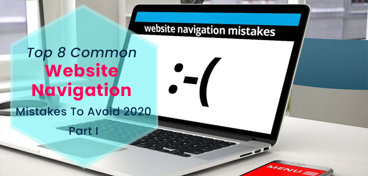
Top 8 Common Website Navigation Mistakes To Avoid 2020…Part I
 September 1, 2020
 Web Development Services Website Development Services
“A user interface is like a joke. If you have to explain it, it’s not that good.”
A great website has impeccable navigation because you don’t want your consumer to just give a visit to your site and leave. If you are aiming for high ROI then navigation of your website is one of the crucial components that should be par excellent as it will ensure the website gets relevant visitors who decide to stay and get the right service. Here are eight major navigation pitfalls that a website can have and make sure to prevent these mistakes.

Find the latest information on Custom Web Development Services in Delhi from Midas. Give us a call today!
1. There is a Fine Line Between Being Creative and Being Overly Creative:
When talking about the navigation of your website, it might be risky to go overboard with being too creative. Website marketing tactics sure offer you the latitude to try new methods and techniques to get the attention of your consumer.
However, as far as it is concerned with the navigation of the website, it is always best to do what your customer is aware of, or if we put it in simple terms it would be best to go with the flow (meaning what people generally expect on a website). For instance, a user is familiar and comfortable with a vertical navigation bar on the left or if it is a horizontal bar it is expected to be at the top of the web page.
Trying something new in this navigation pattern of the website could kill the interest of the user. You can say that the annoying navigation style does contribute to increasing the bounce rate of the website.
2. As The Adage Goes, “Excess of Anything is Bad”:
One key concept to understand about websites is you do not want your potential buyer to get confused and by adding a lot of options in the navigation menu your website will turn into a labyrinth that will do nothing but confuse the buyer and lower the chances of any conversion.
To mitigate such issues you must make sure that the primary navigation of the website should only include options and features which are absolutely important and indispensable. Fewer options will lessen the confusion and website visitors will find it easy to navigate through the site to reach the relevant information or service.
3. Issue of Navigation Inconsistency Across Various Devices:
Your modern user is not going to access your website just from one device. The users you are targeting for your business are reaching out to you through various devices (such as smartphones, PC, tablets, laptop, etc.) so it makes sense to build a website which is consistent across devices when it comes to user interface and navigation.
For instance, if your regular buyer is familiar with the navigation of your website when using it through a laptop and one day they happen to log in or visit your site using a smartphone and they did not find the navigation experience on both devices similar, there is a high risk of losing your loyal customer.
It is not an issue to have different submenus for your mobile and desktop website but what is important is not to tamper with the primary controls and navigation of the website.
4. Concept of Hidden Navigation on Desktop Website and What Actually Kills The Joy! :
Website designs have always evolved and it makes sense to follow the trend. However, make sure to double check and evaluate what suits your consumer/user.
We know that minimalist designs are quite popular and in demand for websites. Minimalist designs have fascinating and attention catching large high-definition images relevant to the brand with only fewer options available on the home page. Now the catch is, websites try to hide the navigation under the hamburger icon.
While this navigation style works for the mobile screens, it doesn’t really do justice to the overall functionality of the desktop website. A study has proven that the hamburger icon is better for mobile websites but not so successful for the desktop websites.
Conclusion:
We are not done yet; find out what are other most common navigation mistakes that can ruin the user experience. Stay tuned to our blog section for the next update. However, we also have a great expertise in designing and developing robust websites. So, feel free to reach out to us for quick consultation or budget-friendly service or web development services from India. You Can Drop An Email or Give Us a Call Anytime.
popular post
-
Unlock Secrets Of UX With These UX Research Methods

-
Why Build A Website Using PHP Framework in 2023?

-
4 Tips To Get The Right Traffic For Your Newly Developed Android App

Categories
- Internet Marketing (13)
- Software Development (8)
- Mobile Apps Development (44)
- Web Designing (32)
- Web Development (60)
 business@midaswebtech.com


