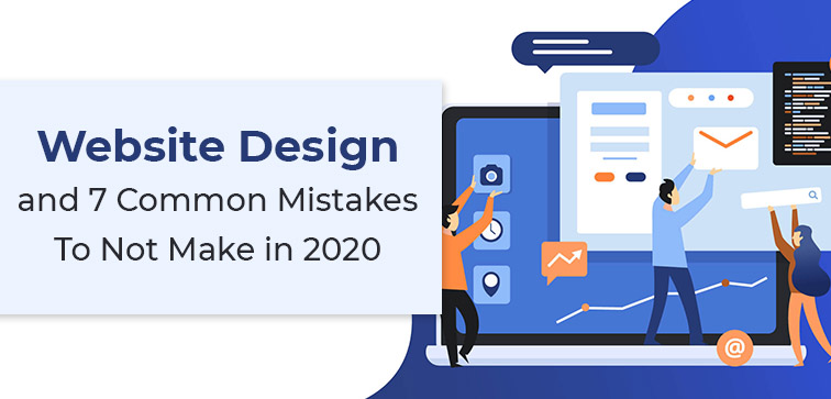
Website Design and 7 Common Mistakes To Not Make in 2020…Part I
 August 20, 2020
 Website Designing Services Website Redesign Services
“Your website is the center of your digital eco-system, as a brick and mortar location, the experience matters once a customer enters, just as much as the perception, they have of you before they walk through the door.”― Leland Dieno
When we say website design, it instantly has to do with your brand and how it will present, connect, impact, and influence your target consumer. Website design is an important component for your business because it impacts how your consumer/buyer perceives your brand.

Midas is the top Custom Web Development and Designing Company that offers you great service when it comes to building exquisite and impactful websites. Give us a call today!
We invent and reinvent our design styles to match our clientele needs in order to stay abreast of the on-going website design and development trends in the market. An impeccable website in today’s market will be able to foster clientele relationships while establishing brand credibility. If you are aiming for a professional website then make sure the site is user-friendly and offers a steady flow of website leads.
Any time is a good time to get your website game strong! Whether you are starting from scratch or refurbishing the existing one, with the right planning and of course expert guidance it is possible to ace your website presence.
Through this two part blog series we will find out the seven major issues with your website design that you should not avoid as it can impact the overall business presence. Let’s jump right in then, shall we!
1. Absence of Clear Call to Action:
There are several factors that can make your potential client lose interest in your service and misplaced or missing Call to Action is certainly one of them. In our experience of over eighteen years, we have actually come across dozens of websites with misplaced CTA and those websites sure struggled to bring in more buyers for their business.
A well put together business website will have clear navigation and impeccable user experience. That being said, your website should be able to help your customer to get the What, Where, and How information instantly, without them having to rummage through the whole website end-to-end.
CTA or Call to Action will give a clear indication to the user what their next step should be if they are aiming for the service. Use clear, concise, and persuasive language when deciding your CTA and attaching it to a link or button.
CTA clearly Tells the User what they need. Here are Some Common and Most Commonly used strong website CTAs:
• Get Started
• Contact Us Today
• Add to Cart
• Buy Now
• Yes, Sign Me Up!
2. Not Using Any Analytics To Measure The Site Performance:
Well, we are living in a time of cut-throat competition, aren’t we?! So, how are you going to know whether your designed website is fetching the right results and you are getting the expected reactions from your users/consumers sans any website analytics tool!
You have to measure the performance, assess the change in consumer behavior, and how they are responding to your site development and user interface. More than 75 percent of small to medium scale business websites do not use any analytical tool to evaluate and track their performance. You can start with the most common and widely used Google analytics, the metrics tool to measure your performance. Get the valuable information and accordingly set up new goals for conversion.
You can combine the data you fetch from analytics with your digital advertising and promotions strategy to market your services to your target audience in a more organized and effective way. Midas has the expert solutions for the custom web development and designing services and our India based firm will help you with 360 degree website design and maintenance service.
3. Ambiguous and Unclear Brand Message:
In any business, you need to have a clear motive, vision, and brand message. These are the bedrocks for any strong and competitive brand image.
In the testing times like now, it is more important to focus on the brand message of your website design when trying to reach out to the potential customers out there. Your website design and a brand message should compel the user to pay attention to your services and ultimately persuade them to buy from you.
Your website is a perfect place to describe what motivates you and why your brand/business is the perfect place where your target user can find the relevant service. The website design should be able to consolidate all these minute components together to present a defined business image in front of the online consumer.
Conclusion:
We are not done yet, stay tuned to our second part of this two blog series on common mistakes that you shouldn’t make when designing your website. If you are curious about our services and want to know how you can have the professional website for your business then don’t wait up and Give Us A Call Right Away! You can check out our services section to learn more about the top services that we have been delivering all across the globe for more than one decade now.
popular post
-
Top 5 Reasons Why Your App Failed And What To Do About It

-
How to Hire Perfect Offshore PHP Website Developer?

-
5 Major Reasons Why Website Maintenance is Important

Categories
- Internet Marketing (13)
- Software Development (8)
- Mobile Apps Development (44)
- Web Designing (32)
- Web Development (60)
 business@midaswebtech.com


